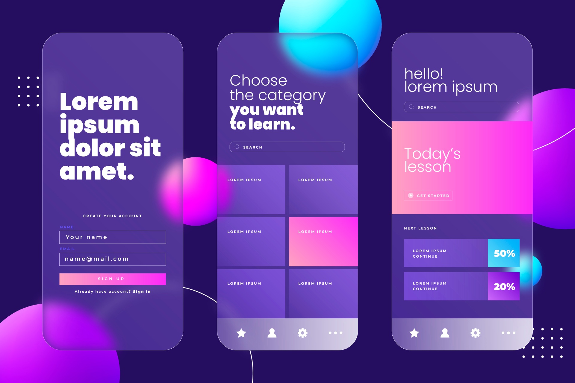
Mastering User Experience: Best Practices for Intuitive Interfaces
In this article, we will explore key principles and techniques for designing intuitive interfaces that users love to interact with.
Created by: Otse Amorighoye /
Vetted by:
Adeshola Bello
Introduction to User Intuitive Interfaces
In today’s digital age, user interface (UI) and user experience (UX) design play a pivotal role in the success of software applications and websites. A well-designed interface can significantly enhance user experience by making interactions intuitive, efficient, and enjoyable. Conversely, a poorly designed interface can frustrate users, leading to abandonment and negative reviews.
To ensure that your interfaces are user-friendly and intuitive, it’s essential to follow best practices that prioritize usability and accessibility. In this article, we will explore key principles and techniques for designing intuitive interfaces that users love to interact with.
Understanding Your Users
Before diving into the design process, it’s crucial to understand your target audience and their needs. Conduct user research to gain insights into their preferences, behaviors, and pain points. This can be done through surveys, interviews, usability testing, and analytics data analysis. By understanding your users’ goals and expectations, you can tailor the interface to meet their needs effectively. For more insights on how to attract top talent for your UX team, read Unlocking Potential: How to Attract Top Dev Talent to Your Company.
Conducting User Research
User research is a critical step in the design process. It involves collecting qualitative and quantitative data about users through various methods. Surveys can help gather broad insights, while interviews provide in-depth understanding. Usability testing allows observing real users interacting with your interface, revealing practical issues. Analytics data shows user behavior patterns and trends. Combining these methods gives a comprehensive view of user needs and behaviors.
Creating User Personas
User personas are fictional characters representing different user types that might use your product. They are based on the data collected during user research. Creating user personas helps designers keep the user at the center of the design process. Each persona includes demographic details, goals, challenges, and behavior patterns. Designing with personas in mind ensures that the interface meets the diverse needs of its users.
Keeping It Simple
Simplicity is the cornerstone of good interface design. Avoid cluttering the interface with unnecessary elements or features that may confuse or overwhelm users. Strive for clarity and minimalism by prioritizing essential content and functionality. Use whitespace generously to create breathing room and improve readability. Remember, simplicity not only enhances usability but also contributes to a visually appealing design.
Avoiding Feature Overload
Feature overload can overwhelm users and complicate the interface. Prioritize essential features that align with user needs and remove any redundant or rarely used features. Conducting regular usability testing can help identify which features are genuinely valuable to users.
Implementing Minimalist Design
Minimalist design focuses on the essentials, using simple and clean elements. It reduces cognitive load and helps users focus on what’s important. Techniques such as ample white space, simple color schemes, and clear typography enhance the user experience.
Consistency Is Key
Consistency breeds familiarity and reduces cognitive load for users. Maintain consistency in visual elements such as typography, colors, icons, and layout throughout the interface. Follow established design patterns and conventions to ensure a seamless user experience. Consistency extends beyond the visual aspects to include interactions and navigation. Users should be able to predict how elements will behave based on their prior experiences with similar interfaces.
Visual Consistency
Visual consistency involves using the same colors, fonts, and styles across the interface. It helps create a cohesive look and feel, making the interface more intuitive. Use a design system or style guide to maintain visual consistency. Read Design Systems and Style Guides to learn more about maintaining visual consistency.
Interaction Consistency
Interaction consistency ensures that similar actions result in similar outcomes. For instance, clicking a button should always produce a predictable result. This predictability helps users feel more comfortable and confident using the interface.
Prioritizing Accessibility
Accessibility should be a top priority in interface design to ensure that all users, including those with disabilities, can access and use the application or website effectively. Follow Web Content Accessibility Guidelines (WCAG) to design interfaces that are perceivable, operable, understandable, and robust. Provide alternative text for images, ensure proper contrast ratios for text and background, and support keyboard navigation and screen readers. Making your interface accessible not only benefits users with disabilities but also improves usability for all users.
Designing for Visual Impairments
Designing for visual impairments involves ensuring that content is accessible to users with various types of visual disabilities. This includes providing high contrast between text and background, using large fonts, and offering alternative text for images.
Ensuring Keyboard Accessibility
Keyboard accessibility is crucial for users who cannot use a mouse. Ensure that all interactive elements can be navigated and activated using a keyboard. This includes using tab orders and providing visible focus indicators.
Focusing on User Flow
A smooth and intuitive user flow is essential for guiding users through the interface and accomplishing their tasks efficiently. Map out user journeys and identify potential pain points or bottlenecks in the flow. Streamline navigation by reducing the number of clicks required to reach key features or information. Use clear and descriptive labels for navigation elements to help users understand their purpose. Conduct usability testing to validate the effectiveness of the user flow and make iterative improvements.
Mapping User Journeys
User journey mapping involves creating a visual representation of the steps users take to complete a task. It helps identify potential pain points and opportunities for improvement. This process ensures that the interface aligns with user expectations and needs.
Reducing Clicks
Minimizing the number of clicks required to perform a task improves efficiency and user satisfaction. Ensure that essential functions are easily accessible and do not require excessive navigation. Group related functions logically to reduce cognitive load.
Optimizing for Mobile
With the increasing use of smartphones and tablets, optimizing your interfaces for mobile devices is crucial. Design responsive interfaces that adapt to various screen sizes and orientations. Ensure that touch targets are large enough for easy interaction and that important content is accessible without excessive scrolling. Simplify navigation for mobile users by using familiar gestures and providing quick access to key features. .
Responsive Design Techniques
Responsive design ensures that the interface adapts to different screen sizes and orientations. Use flexible grids, media queries, and scalable images to create a responsive layout. Test the interface on various devices to ensure a consistent experience.
Mobile-Specific Features
Designing for mobile requires considering touch interactions and limited screen space. Use large touch targets, swipe gestures, and simplified navigation to enhance the mobile user experience.
Embracing User Feedback
Listen to user feedback and iterate on the interface based on their suggestions and pain points. Provide channels for users to submit feedback easily, such as contact forms, surveys, or in-app feedback prompts. Actively monitor user reviews and social media mentions to identify areas for improvement. Incorporating user feedback into the design process demonstrates a commitment to continuous improvement and enhances user satisfaction and loyalty. For further guidance on leveraging feedback, see The Importance of Communication and Feedback in Recruitment Processes.
Collecting Feedback
Collect feedback through various channels, including surveys, usability testing, and user interviews. Analyze feedback to identify common pain points and areas for improvement.
Iterative Design
Use feedback to inform iterative design improvements. Continuously test and refine the interface based on user input. This approach ensures that the design evolves to meet user needs.
Utilizing Visual Hierarchy
Visual hierarchy is the arrangement or presentation of elements in a way that implies importance. By strategically organizing elements based on their significance, you can guide users’ attention and make the interface more intuitive. Use techniques such as size, color, contrast, and whitespace to establish a clear hierarchy of information. Important elements should stand out and be easily distinguishable, while less important ones should recede into the background. A well-defined visual hierarchy helps users quickly grasp the structure of the interface and find relevant content or actions.
Techniques for Creating Visual Hierarchy
Use size, color, contrast, and spacing to create a visual hierarchy. Larger elements and bold colors draw attention, while smaller elements and muted colors recede. Group related elements together to create a logical structure.
Benefits of Visual Hierarchy
A clear visual hierarchy enhances usability by guiding users’ attention and making it easier to find important information. It reduces cognitive load and helps users understand the interface quickly.
Optimizing Loading Times
In today’s fast-paced world, users have little patience for slow-loading interfaces. Optimizing loading times is crucial for providing a seamless and enjoyable user experience. Minimize the size of assets such as images, videos, and scripts to reduce load times without sacrificing quality. Implement lazy loading techniques to prioritize the loading of critical content and defer non-essential resources until later. Utilize caching and content delivery networks (CDNs) to serve content quickly to users, regardless of their location. A snappy interface not only improves user satisfaction but also boosts engagement and conversion rates.
Reducing Asset Sizes
Optimize images, videos, and scripts to reduce their file sizes. Use modern image formats, compress videos, and minify scripts. This reduces loading times and improves performance.
Implementing Lazy Loading
Lazy loading defers the loading of non-essential resources until they are needed. This technique prioritizes critical content, improving perceived performance and user satisfaction.
Testing Across Devices and Environments
Users access interfaces from a variety of devices, browsers, and environments, each with its own quirks and limitations. To ensure a consistent and reliable experience for all users, it’s essential to test the interface across different platforms and environments. Conduct cross-browser testing to verify compatibility with popular browsers such as Chrome, Firefox, Safari, and Edge. Test on various devices with different screen sizes, resolutions, and operating systems, including smartphones, tablets, and desktops. Consider factors such as network conditions and device capabilities when testing performance and responsiveness.
Cross-Browser Testing
Cross-browser testing involves ensuring that your interface works as intended across different web browsers. It helps identify and fix compatibility issues that could affect user experience. Use tools like BrowserStack or CrossBrowserTesting to facilitate this process.
Device Testing
Testing on various devices ensures that your interface is responsive and performs well on different screen sizes and resolutions. This includes smartphones, tablets, and desktops. Emulate different network conditions to ensure the interface loads quickly and efficiently in various scenarios.
Design Systems and Style Guides
Design systems and style guides serve as the foundation for creating consistent and scalable user interfaces. They establish a shared language and set of principles that guide the design and development process, ensuring a unified experience across an entire product or suite of products. Learn more about Design Systems and Style Guides.
What is a Design System?
A design system is a comprehensive collection of reusable components, patterns, guidelines, and resources that bring structure and consistency to product design and development. It encompasses everything from typography and color palettes to UI components like buttons, forms, and navigation menus.
Benefits of Design Systems
Consistency: Design systems ensure a cohesive look and feel across all touchpoints, creating a seamless experience for users.
Scalability: By providing a centralized repository of components and guidelines, design systems enable teams to scale their design efforts efficiently.
Communication: Design systems foster better collaboration and communication between designers, developers, and stakeholders by establishing a shared design language.
Style Guides
Style guides are a crucial component of a design system. They document design principles, brand guidelines, UI patterns, and code conventions, serving as a reference for the entire team. Well-documented style guides promote consistency, improve onboarding for new team members, and facilitate handoffs between designers and developers.
UI Design Patterns and Components
UI design patterns and components are the building blocks of user interfaces. They represent reusable solutions to common design problems, providing a consistent and familiar experience for users while accelerating the design and development process. Learn more about Building Effective UI Patterns.
UI Design Patterns
Design patterns are proven solutions to recurring design problems. Some examples include:
Navigation Patterns: Hamburger menus, breadcrumbs, tab interfaces, and more.
Content Organization Patterns: Cards, grids, carousels, accordions, and modals.
Input Patterns: Form layouts, input validation, and feedback mechanisms.
UI Components
Components are the individual UI elements that make up a user interface. Common examples include:
Buttons: Primary, secondary, icon buttons, and button groups.
Forms: Input fields, checkboxes, radio buttons, and select dropdowns.
Navigation: Menus, tabs, breadcrumbs, and pagination controls.
Feedback: Notifications, alerts, progress bars, and loaders.
By understanding and leveraging UI design patterns and components, designers can create interfaces that are both visually appealing and intuitive, reducing the cognitive load on users and improving overall usability.
Responsive and Adaptive Design
In today’s multi-device world, it’s essential to design interfaces that adapt to different screen sizes, resolutions, and input methods. Responsive and adaptive design techniques ensure that your UI provides an optimal experience regardless of the device or viewport size.
Responsive Design
Responsive design involves creating flexible layouts that fluidly adjust to different screen sizes and resolutions. This is typically achieved through the use of flexible grids, media queries, and flexible media (images and videos).
Adaptive Design
Adaptive design goes a step further by tailoring the UI to specific device characteristics and user contexts. This approach involves creating multiple layouts or experiences optimized for different devices, viewports, or use cases.
Best Practices for Responsive and Adaptive Design
Mobile-First Approach: Start by designing for the smallest screen sizes and then progressively enhance the experience for larger viewports.
Flexible Layouts: Utilize grid systems and flexible units (like percentages or viewport units) to create layouts that gracefully adapt to different screen sizes.
Prioritize Content: Determine the most important elements and content for each viewport size and emphasize them accordingly.
Optimize Assets: Ensure images, videos, and other media are optimized for various screen densities and network conditions to maintain performance.
User Context: Consider factors like input methods (touch vs. mouse), device orientation, and environment (e.g., low light) when designing for different contexts.
By embracing responsive and adaptive design principles, you can create user interfaces that provide a seamless and optimized experience across a wide range of devices and environments.
Mobile UI Design Considerations
With the proliferation of smartphones and tablets, mobile UI design has become increasingly important. Designing for mobile devices requires a unique set of considerations to account for smaller screen sizes, touch-based interactions, and varying user contexts.
Mobile Design Principles
Simplicity: Prioritize essential content and functionality, and minimize clutter and distractions.
Thumb-Friendly Interactions: Design for thumb-based navigation and input, placing important actions within easy reach.
Gestural Interactions: Incorporate intuitive gestures like swiping, pinching, and tapping to enable natural interactions.
Responsive and Adaptive Design: Ensure your UI adapts to different screen sizes, resolutions, and orientations.
Accessibility: Consider accessibility factors like font sizes, color contrast, and touch target sizes to cater to users with varying abilities.
Mobile UI Components
While many UI components are shared across platforms, there are some mobile-specific components to consider:
Bottom Navigation Bars: Persistent navigation elements at the bottom of the screen for easy thumb access.
Hamburger Menus: Space-saving menus that slide out from the side or top of the screen.
Cards and Tiles: Content containers that present information in a concise and scannable format.
Pull-to-Refresh: Gesture-based interactions that allow users to refresh content by pulling down on the screen.
Sliders and Steppers: Interactive components for selecting values or adjusting settings with touch input.
By understanding and implementing these mobile-specific design principles and components, you can create user interfaces that feel intuitive and tailored to the unique characteristics of mobile devices.
Bringing It All Together
Mastering UI design involves understanding and harmoniously combining various concepts and best practices. By creating a strong design system, leveraging UI patterns and components, embracing responsive and adaptive design principles, and considering mobile-specific requirements, you can create user interfaces that are visually appealing, consistent, and optimized for a wide range of devices and contexts.
Continuous Improvement
Great UI design is not just about aesthetics; it’s about creating experiences that are intuitive, efficient, and delightful for users. By prioritizing user needs and continuously iterating based on feedback and data, you can refine your craft and create interfaces that truly captivate and engage your audience. Embrace these UI design principles, stay curious, and always strive to create exceptional user experiences. The journey may be challenging, but the rewards of crafting impactful and user-centric interfaces make it all worthwhile.
FAQ Section
1. What are some key principles of intuitive UI design?
Key principles of intuitive UI design include simplicity, consistency, accessibility, and prioritizing user needs. Understanding your users, maintaining visual and interaction consistency, ensuring accessibility, and focusing on user flows are essential for creating user-friendly interfaces.
2. How can I ensure my interface is accessible to all users?
To ensure accessibility, follow Web Content Accessibility Guidelines (WCAG). Provide alternative text for images, ensure proper contrast ratios, support keyboard navigation, and design for screen readers. Accessibility not only benefits users with disabilities but also improves overall usability.
3. What is the importance of responsive design?
Responsive design ensures that your interface adapts to different screen sizes and orientations, providing an optimal experience on various devices. This is crucial in today’s multi-device world, where users access content from smartphones, tablets, and desktops.
4. How can I effectively collect and use user feedback?
Collect feedback through surveys, usability testing, user interviews, and monitoring reviews and social media mentions. Use this feedback to inform iterative design improvements, continuously testing and refining the interface based on user input to meet their needs better.
5. Why is visual hierarchy important in UI design?
Visual hierarchy helps guide users’ attention to the most important elements first, reducing cognitive load and making it easier to find relevant content. Techniques like size, color, contrast, and spacing are used to establish a clear hierarchy, enhancing usability and user satisfaction.
By following these best practices and continuously improving your design based on user feedback and data, you can create intuitive and user-friendly interfaces that enhance the overall user experience.
For more information on related topics, check out these articles:
By exploring these resources, you can gain a deeper understanding of various aspects of UI/UX design and improve your approach to creating intuitive and user-friendly interfaces.